CSS Flex
section (parent), div (child)
50 / 50
Left Content
Right Content
<style>
.case1{
display: flex;
}
.case1 div:nth-child(1){
flex: 1;
background-color: cadetblue;
}
.case1 div:nth-child(2){
flex: 1;
background-color: plum;
}
</style>
<section class="case1">
<div>Left Content</div>
<div>Right Content</div>
</section>
66 / 33
Left Content
Right Content
<style>
.case2{
display: flex;
}
.case2 div:nth-child(1){
flex: 2;
background-color: cadetblue;
}
.case2 div:nth-child(2){
flex: 1;
background-color: plum;
}
</style>
<section class="case2">
<div>Left Content</div>
<div>Right Content</div>
</section>
25 / 75
<style>
.case3{
display: flex;
}
.case3 img{
max-width: 100%;
}
.case3 div:nth-child(1){
flex: 1;
}
.case3 div:nth-child(2){
flex: 3;
}
</style>
<section class="case3">
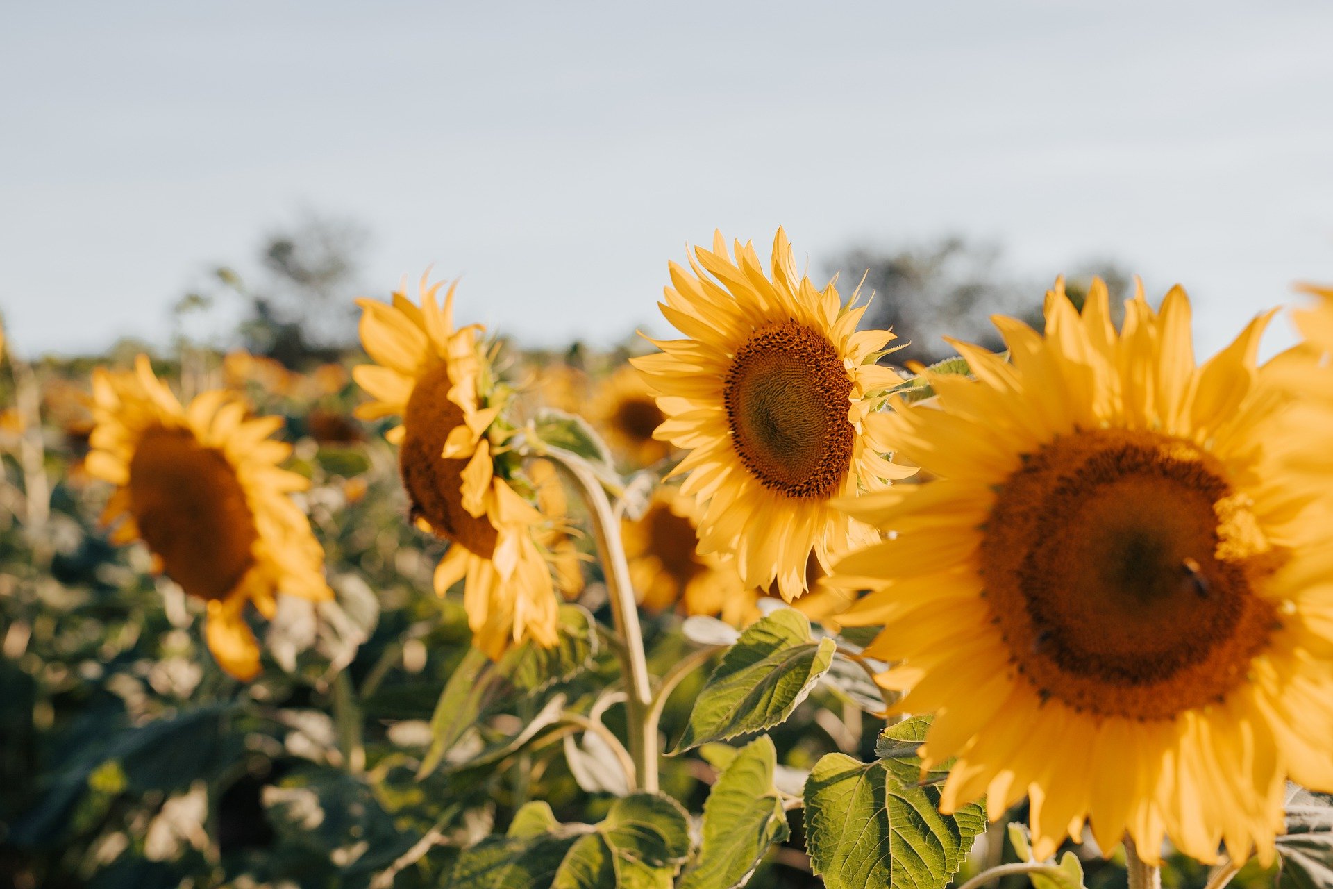
<div><img src="sunflowers.jpg" alt="sunflowers"></div>
<div><img src="mountains.jpg" alt="mountains"></div>
</section>
50 / 50 responsive
Näyttöä kaventaessa, elementit asettuvat allekkain.
Left Content
Right Content
<style>
.case4{
display: flex;
flex-wrap: wrap;
}
.case4 div{
flex-grow: 1;
flex-shrink: 1;
flex-basis: 400px
}
.case4 div:nth-child(1){
background-color: cadetblue;
}
.case4 div:nth-child(2){
background-color: plum;
}
</style>
<section class="case4">
<div>Left Content</div>
<div>Right Content</div>
</section>